Have you ever wondered why some pages on your website are busy while others seem empty. Welcome to the world of heatmaps your new secret weapon in the fight for a great user experience. Imagine a colourful map that shows where your users click scroll and stay for a long time. These tips are worth their weight in gold for UX designers developers and marketers. They give you a behind the scenes look at how well your website is doing so you can make changes improve and optimise every pixel for success.
A Key Tool for Data Driven UX.
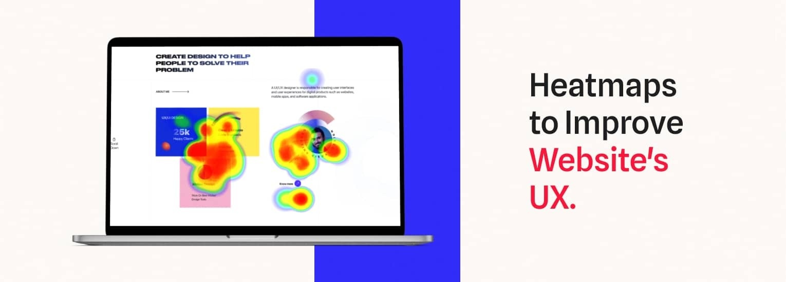
In user experience design heatmaps are colourful pictures that show where people click scroll and spend time on your website. They work like a digital thermal camera for your website showing hot spots in red where people are most interested and cold spots in blue where they are least interested. Heat maps show you how users act without giving you too much information. They show you which parts of your site are getting traffic and which are not just like a treasure map. This graphic analysis shows what parts of the design are good and could be better. It changes everything for UX designers and marketers. It can help you put buttons that tell people what to do in the right places. Need to change the layout to get people involved. It show where users leave which can help you change the design.
Leveraging Heatmaps and Analytics for Improved User Experience Metrics.
Understanding Heatmaps in UX Design.
Heatmaps are not just pictures of data they are your secret weapon for learning how people use your site. Your site bright areas show where people are going. Red zones are places where people click or stay while more blue zones are places people might overlook.
Making data into useful information.
Analytics data heatmaps are amazing when used together. Think about knowing where and why people click. Find areas that need redesigned or improve their content by looking at how users interact with them. That button to call to action might not be interesting or important information might be hidden below the scroll. Analytics link seeing something to doing something.
Increasing User Experience Metrics.
Use these insights to make your UX better. Changing the layout or moving things around to make navigation easier can make people more interested. These changes can improve the user experience by lowering bounce rates lengthening sessions and making the site easier to use. Using heatmaps and analytics improves the design and makes the experience smooth and easy for users which keeps them coming back.
Exploring User Interactions How Heatmaps Improve Website Design.
Visualizing User Arrangement.
Heatmaps are your secret weapon for website user interaction decoding. Think about seeing where visitors click tap or linger. This visualisation shows popular (red hot) and overlooked (calm blue) regions. By analysing this data you can see what your audience notices and what they ignore. A deliberate redesign may be needed if a crucial call to action button is devalued in a cold zone.
Pathway to Intuitive Design.
It is about creating a smooth user journey with heatmaps not just identifying hot and cold spots. Once you know how users explore your site you may change the layout to help them convert. Imagine a homepage that follows natural user routes eliminating friction and improving site experience. This redesign improves functionality aesthetics and user pleasure.
Uncovering Hidden Patterns.
Standard analytics may overlook heatmap patterns. Repeated clicks on non clickable objects or prolonged scrolling show user irritation. Addressing these difficulties is crucial to reducing dropouts and increasing participation. Based on these insights you may change and test design aspects to build a dynamic environment that adapts to user demands keeping your site user friendly and efficient.
Using heatmaps lets you see what your consumers desire in colourful detail. Your secret for increasing and simplifying navigation is visual insights. Create a user friendly masterpiece by tweaking and testing. First impressions are essential in the digital age so why not make yours memorable.